Brief
Grounded in a strategic reading of Etro's core challenges — limited digital presence, low engagement with younger audiences, and resulting financial instability — this concept identifies music and the live festival experience as the most culturally relevant and brand-authentic entry point for reconnection.
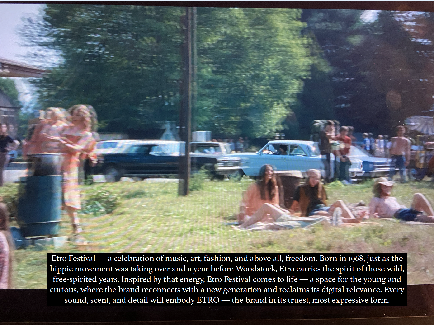
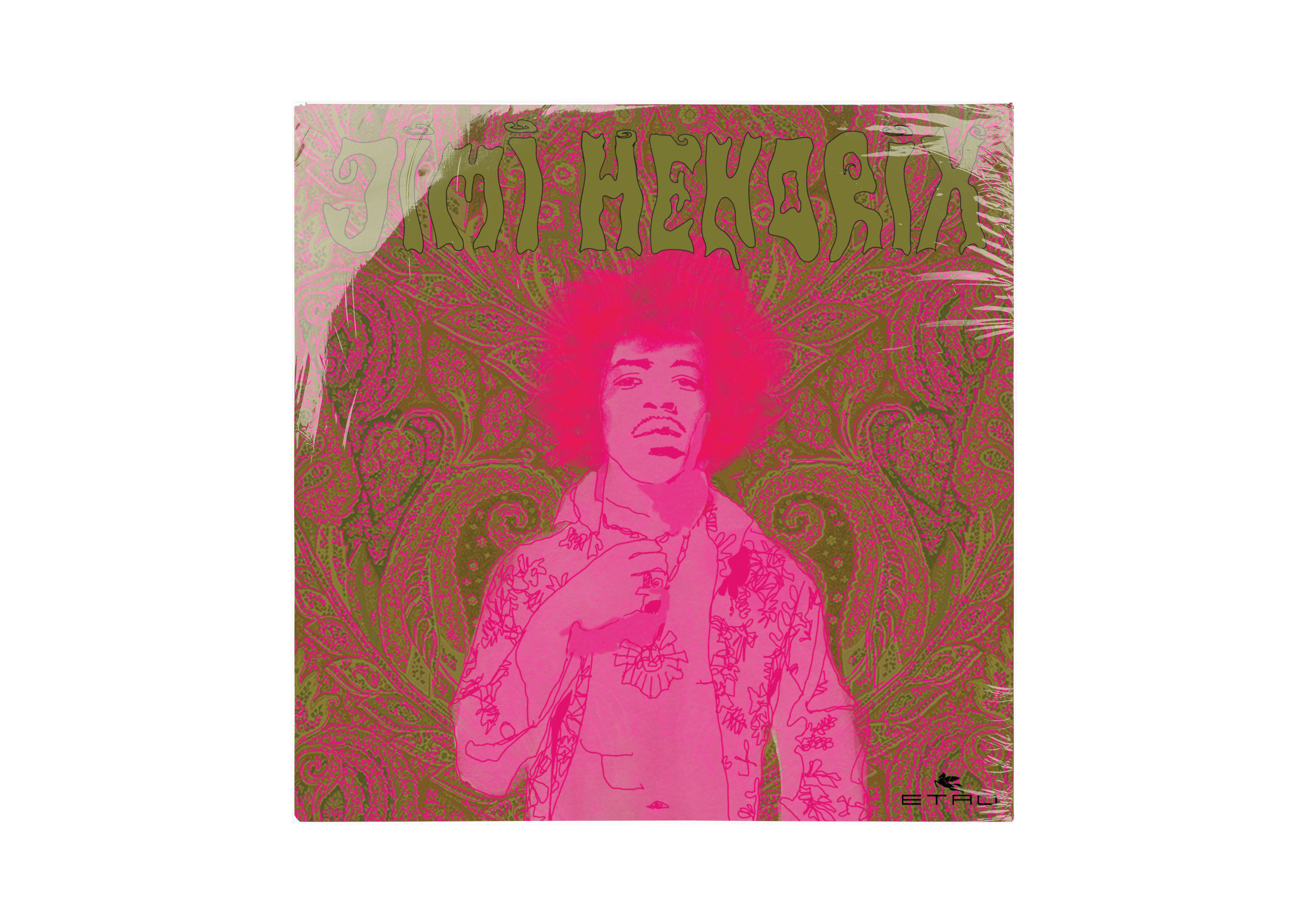
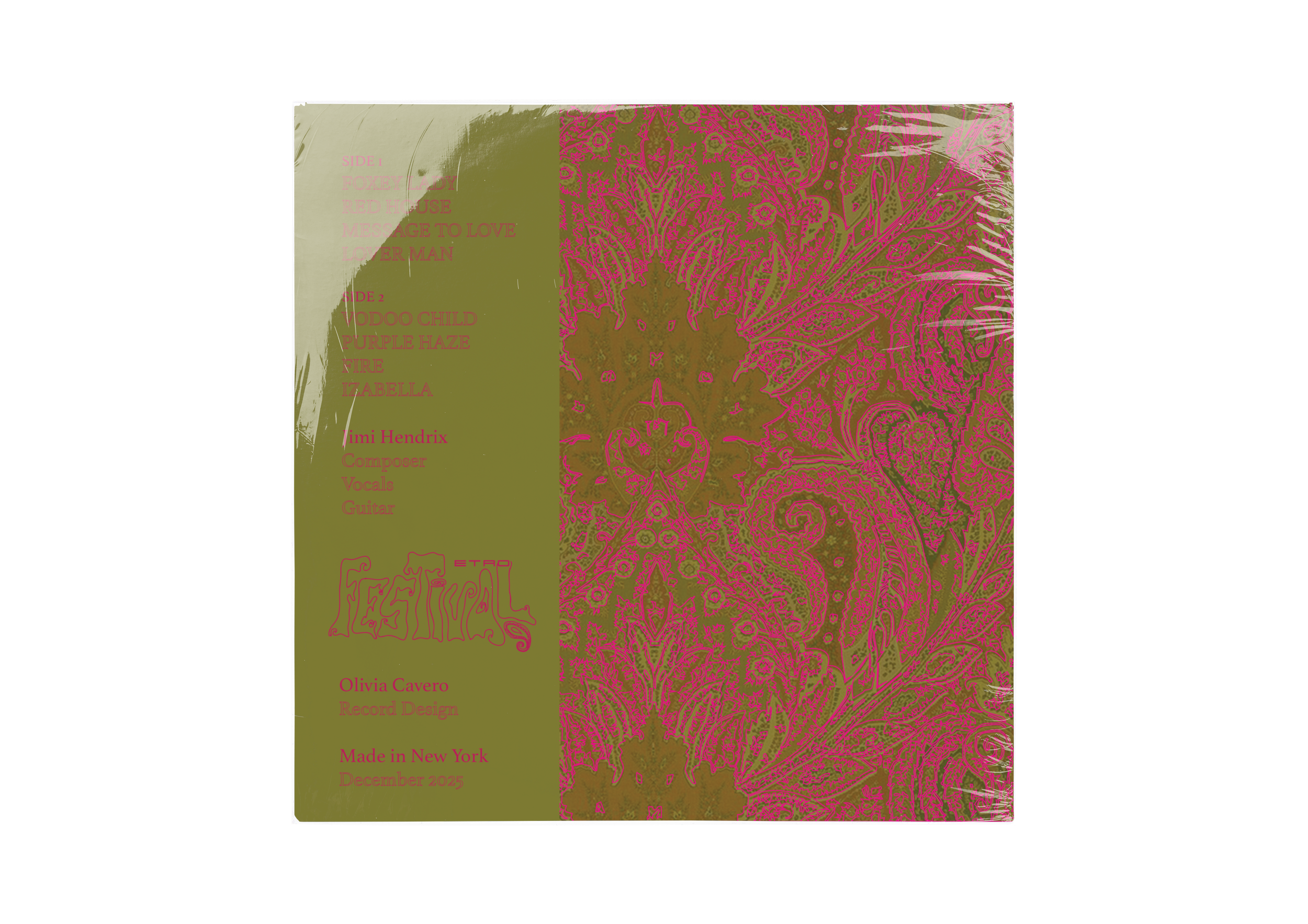
Rather than reinventing Etro's identity, the strategy amplifies what is already intrinsic to it. The brand's founding year of 1968 places it at the epicenter of the countercultural movement that produced Woodstock (1969), making the late 1960s and early 1970s not a borrowed aesthetic but a native one. Paisley, saturated color, fluid silhouettes, and a philosophy of radical individuality are not references Etro adopted — they are the foundation it was built on.
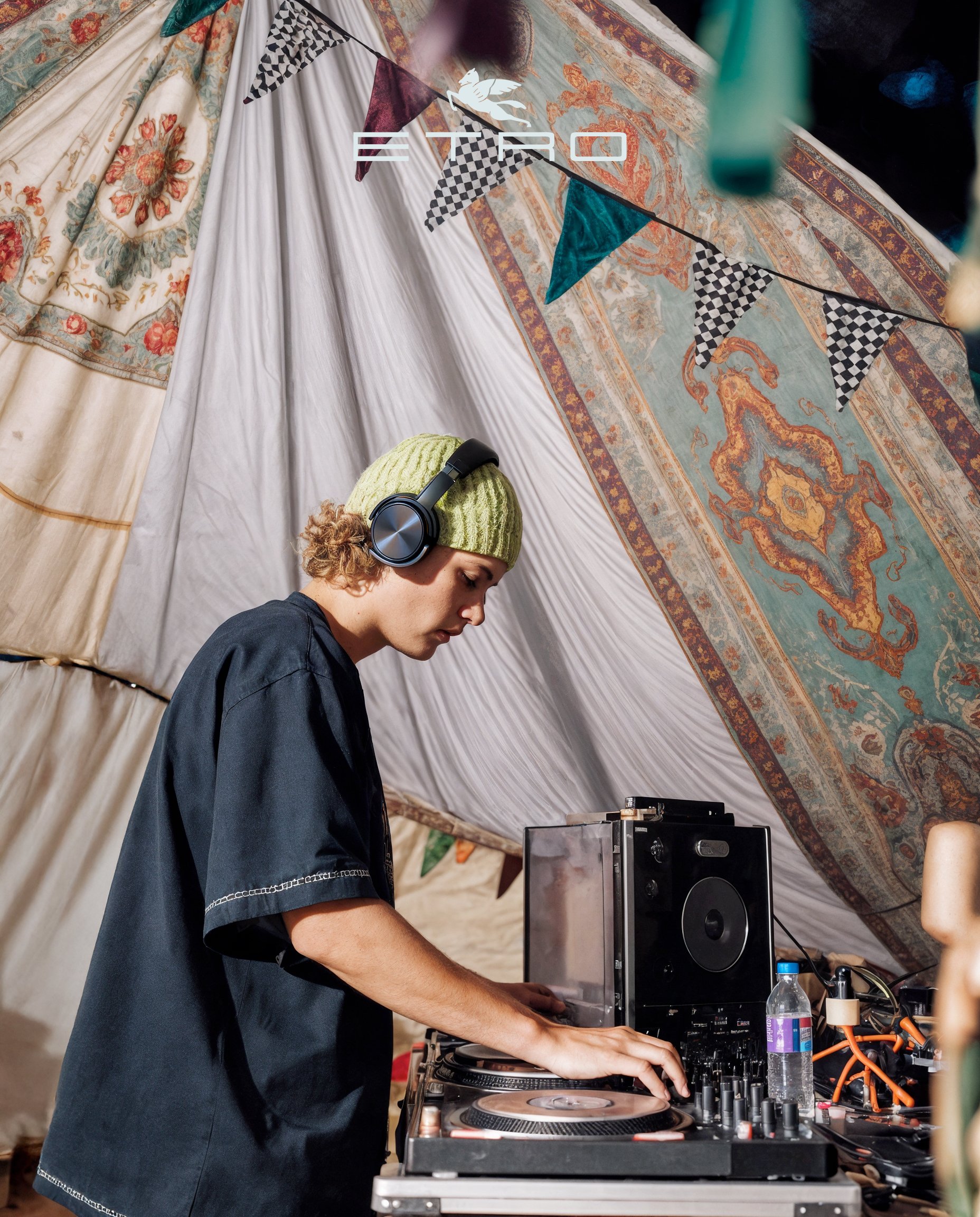
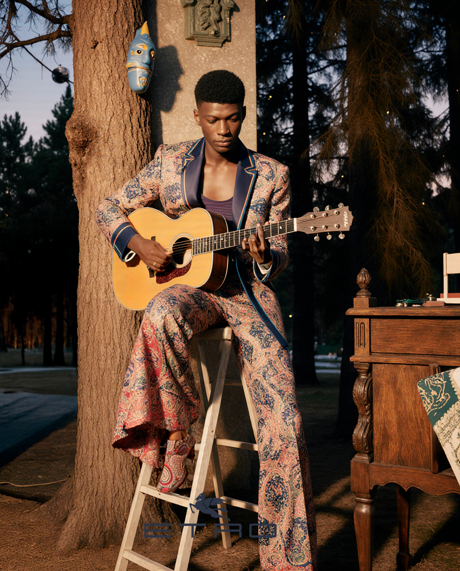
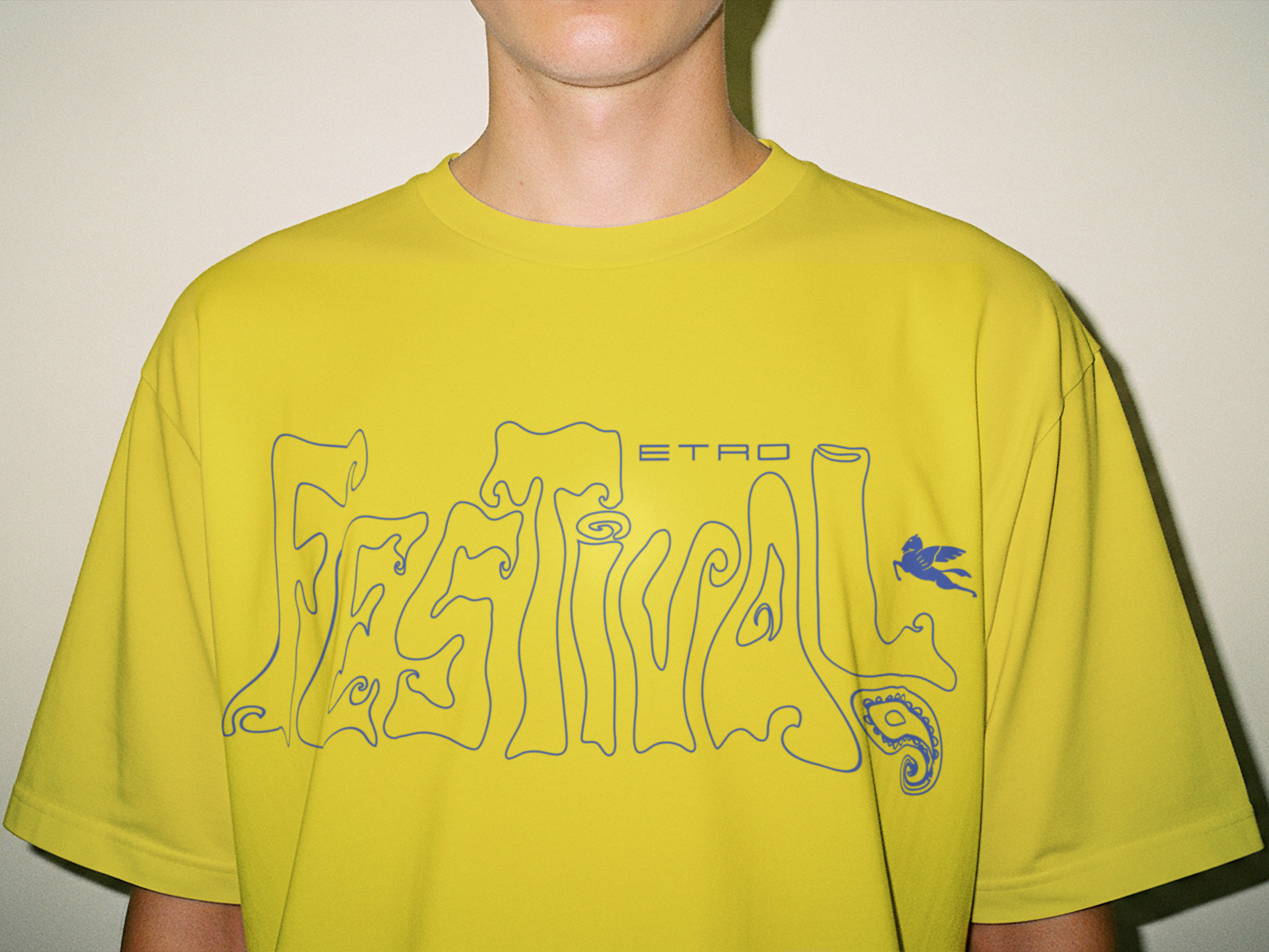
The Etro Music Festival translates this into a fully branded live experience: artists performing in the AW25 collection, immersive retail activations, and a cohesive visual world spanning stage design, campaign materials, and social content — engineered to generate organic reach among younger audiences.
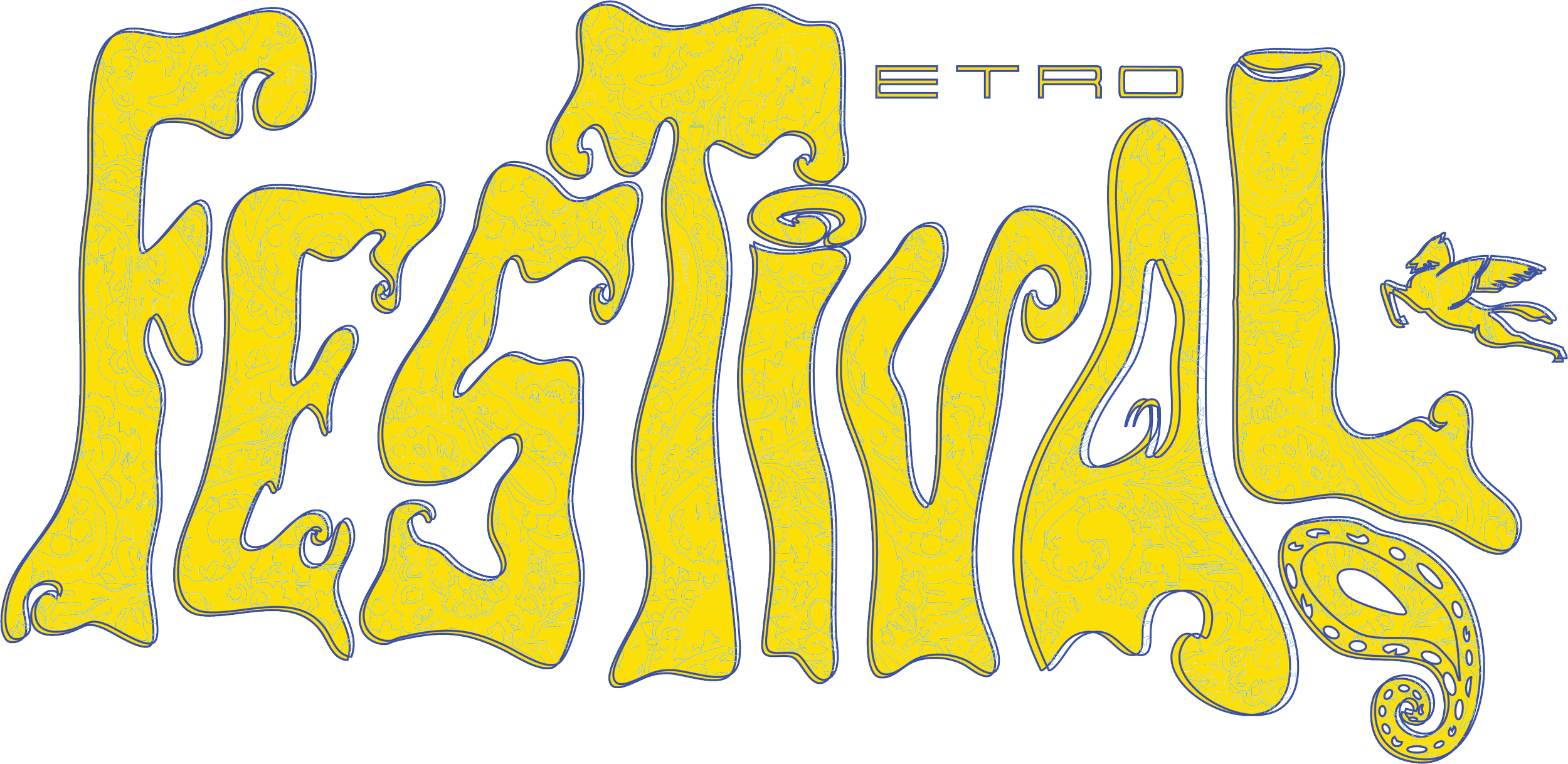
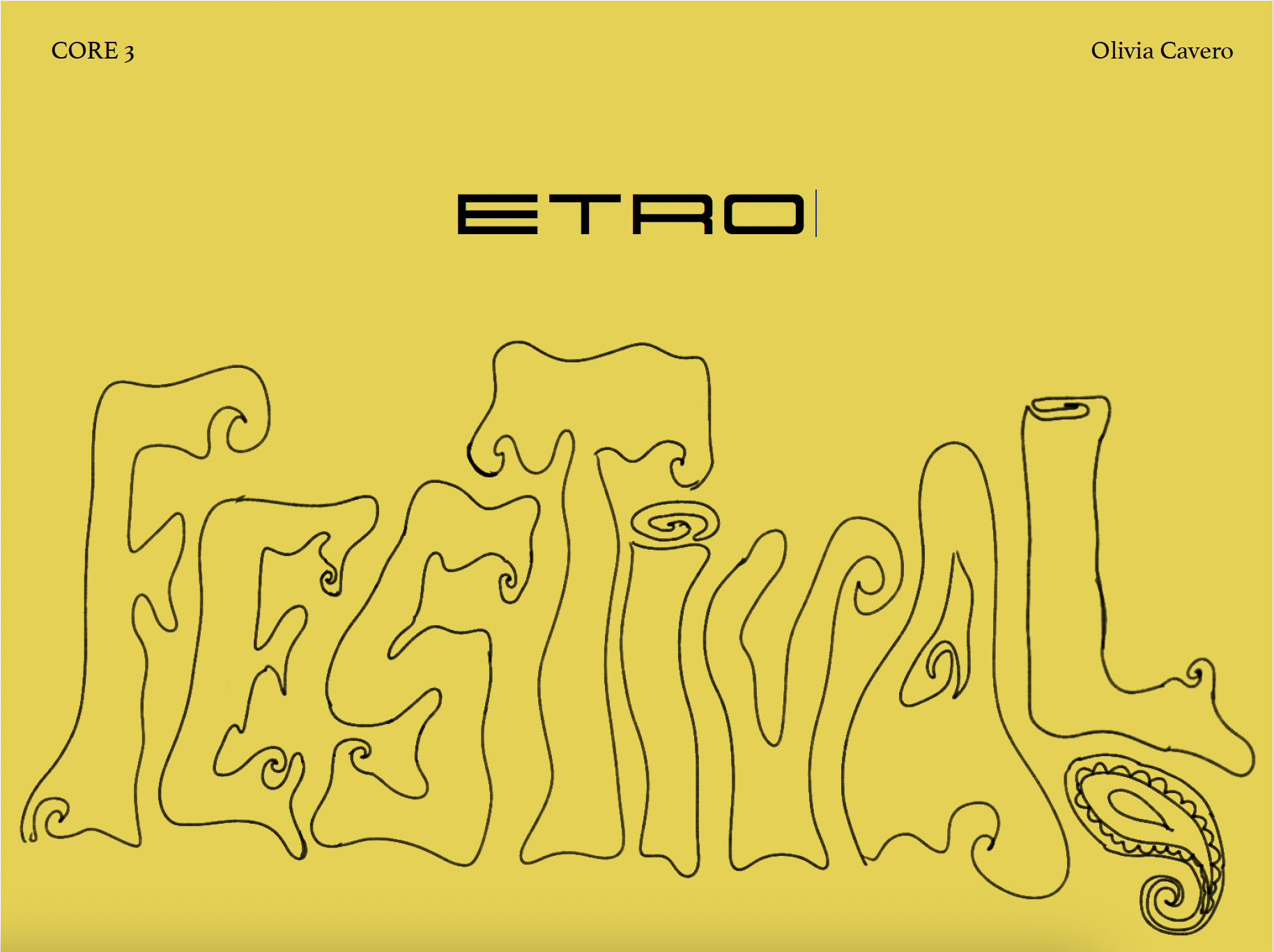
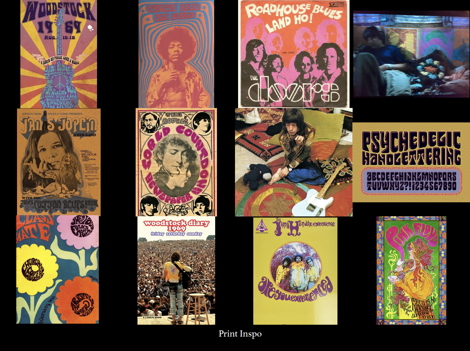
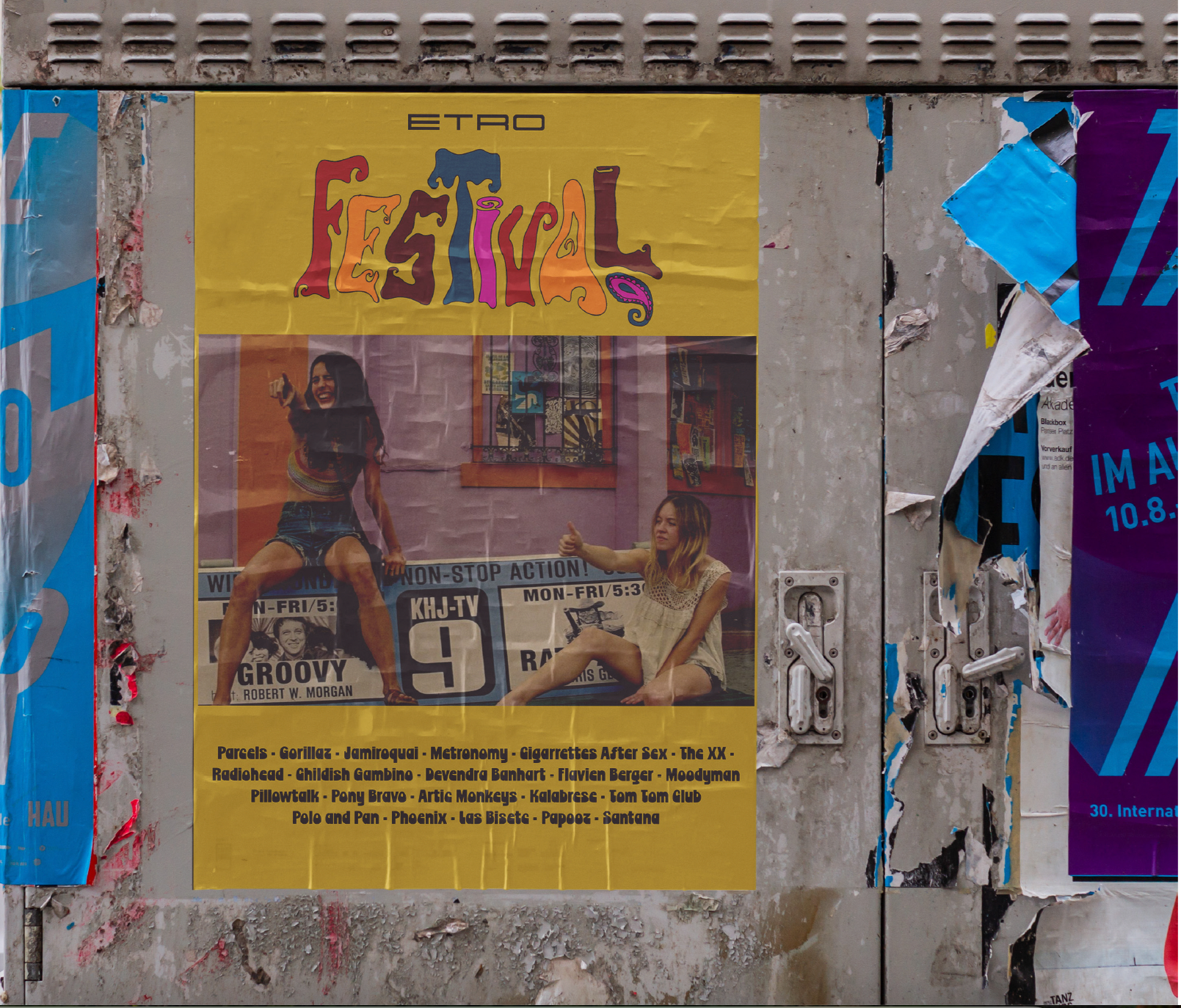
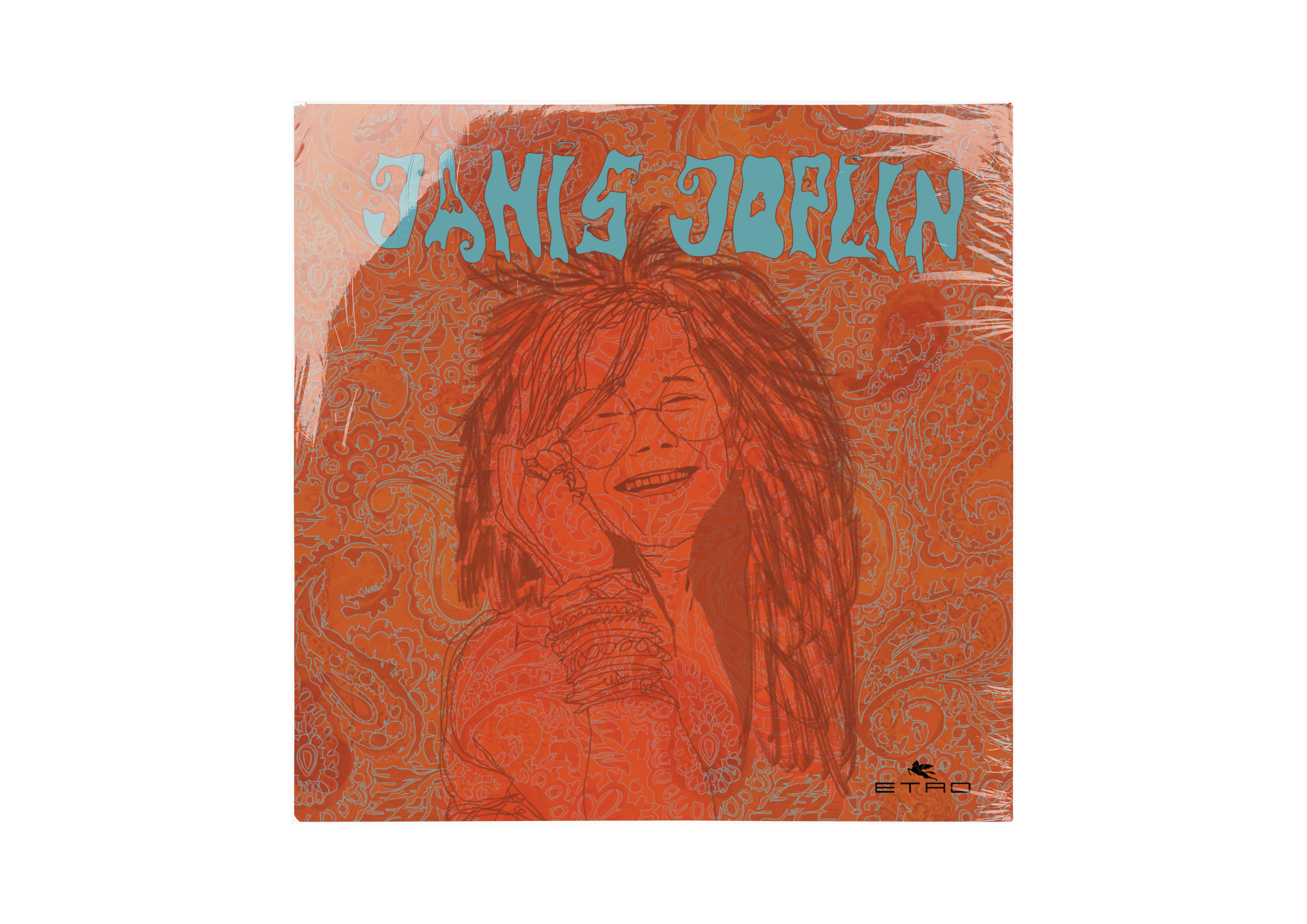
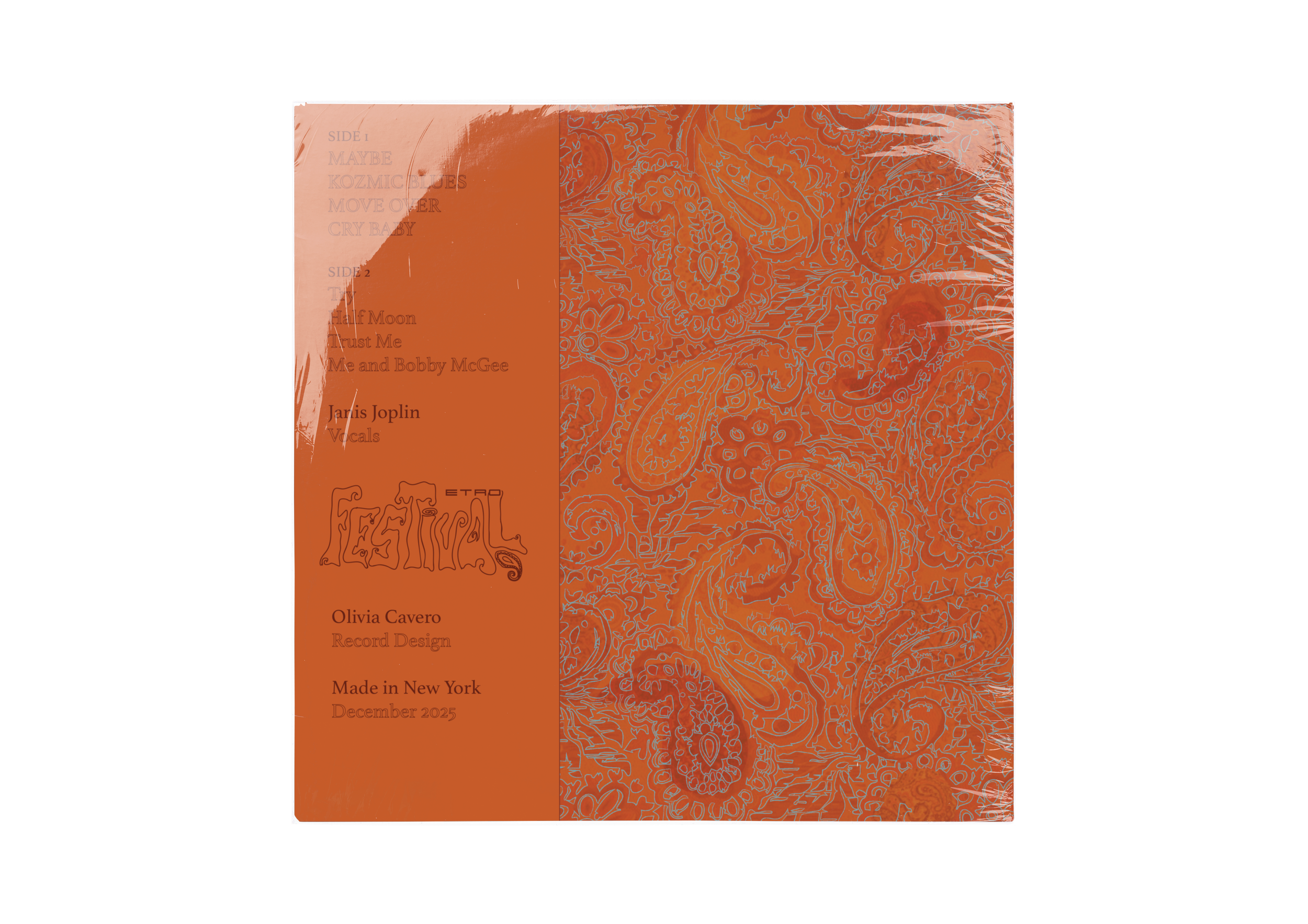
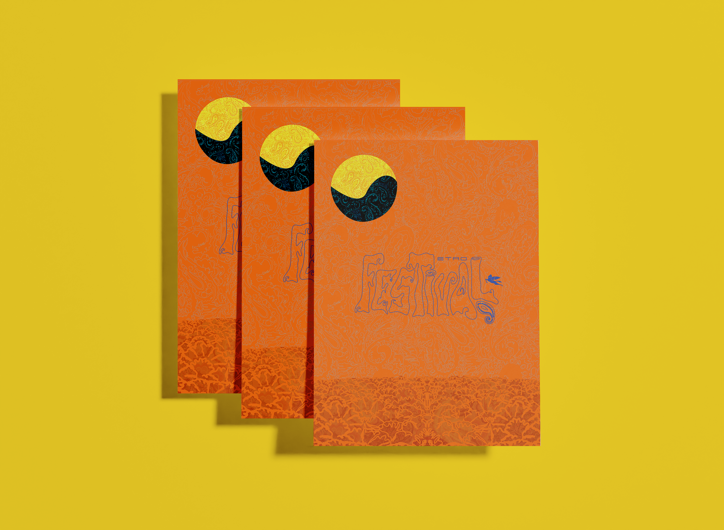
Visually, the campaign draws on cinematic and archival references including Once Upon a Time in Hollywood, Taking Woodstock, and period rock album artwork, reinterpreting hippie-era imagery with a contemporary edge that feels urgent rather than nostalgic. Tangible outputs include redesigned 1970s-inspired record sleeves as promotional material, a campaign poster, a hand-drawn festival logo refined in Illustrator, artist illustrations developed in Procreate, and custom paisley patterns built in Photoshop and layered in Illustrator for chromatic depth.
Krea 1 used for image generation, enhancement and edition. Photoshop AI used for image edition. Figma used for website design. Adobe Illustrator used for album covers. Adobe Photoshop used for mock ups.
Moodboard
Process


Prompt
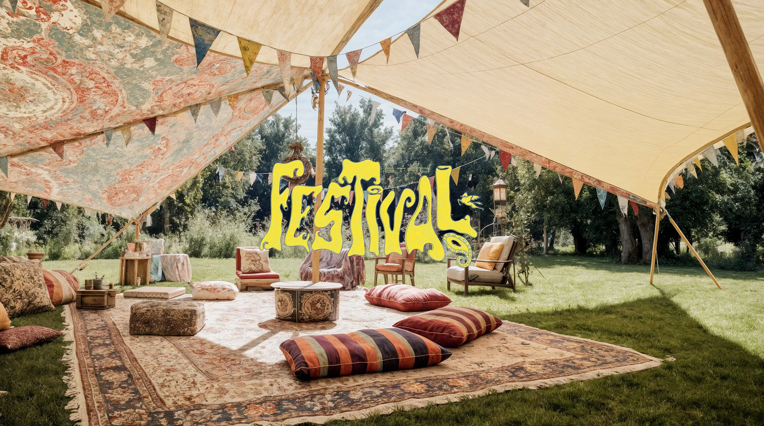
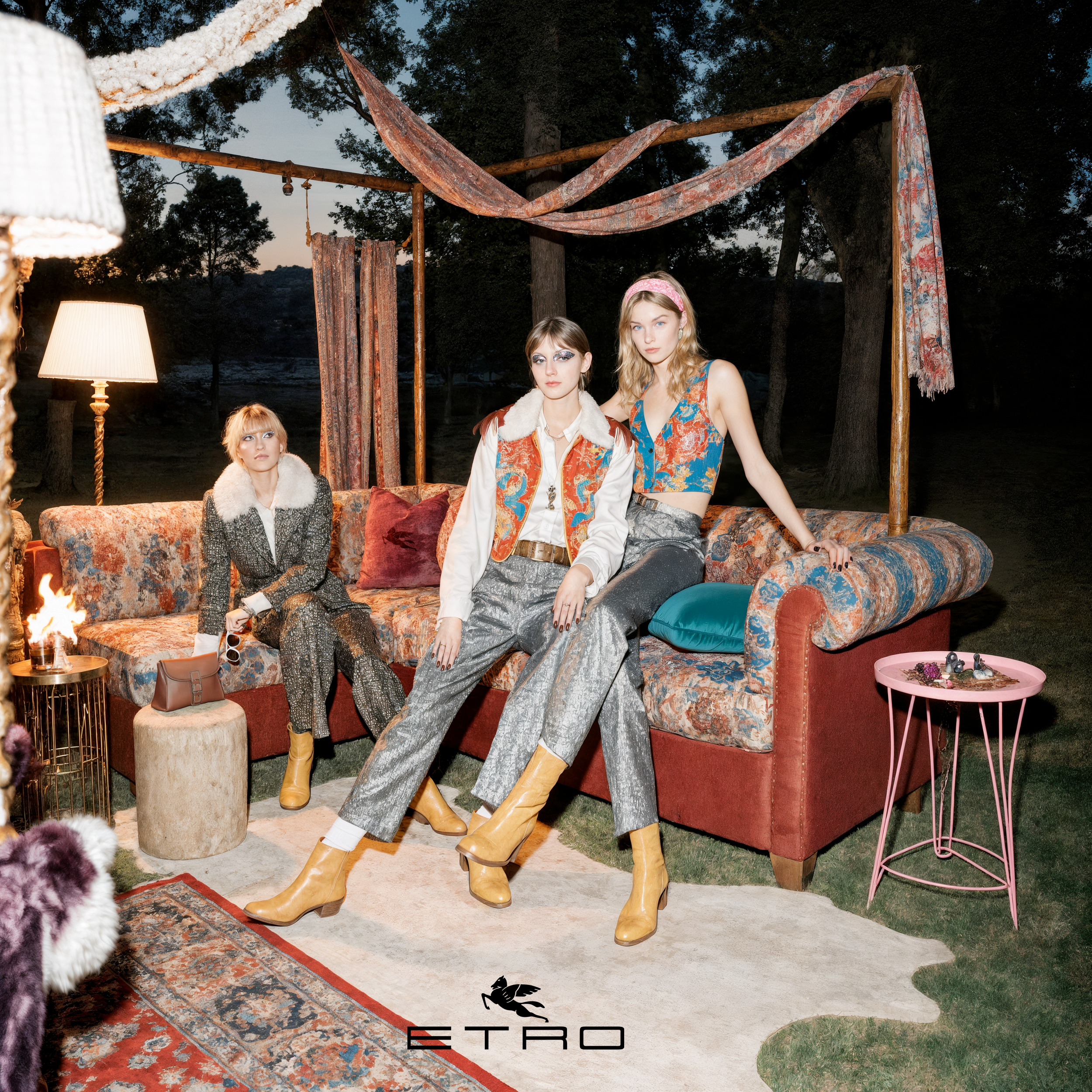
Ultra-realistic cinematic photograph of a small, exclusive luxury fashion festival in a forest at sunset, inspired by Etro, NOT a generic boho festival. Environment: curated outdoor installation in the woods, refined and designed, with custom-built Etro furniture, low sofas, structured booths, textile-covered structures, everything wrapped in rich paisley fabrics and intricate patterns Design language: strong Etro identity — bold paisley prints, layered textiles, tapestry-like fabrics, luxurious materials, no minimalism, no generic festival decor People: highly styled fashion crowd, editorial looks, elevated hippie aesthetic, flowing silhouettes, silk, prints, scarves, statement layering, looks like a fashion campaign not real life Composition: intentional, symmetrical, editorial framing, not random candid crowd. Lighting: golden hour sunset filtering through trees, warm cinematic glow, soft haze. Textures: extremely detailed fabrics, visible weave, embroidery, rich color depth. Mood: exclusive, intimate, artistic, sensual, refined Woodstock-inspired but elevated into high fashion. Photography: shot on film, shallow depth of field, cinematic, slightly imperfect, no CGI look, no generic festival vibes
IMPORTANT: No modern plastic objects, no basic camping tents, no generic boho styling, no mainstream festival look. Focus on textile richness, fashion styling, and brand world. scene feels designed, not accidental, like a fashion brand installation.
AI Generated
Generated with Krea 1, edited with Krea and Photoshop AI

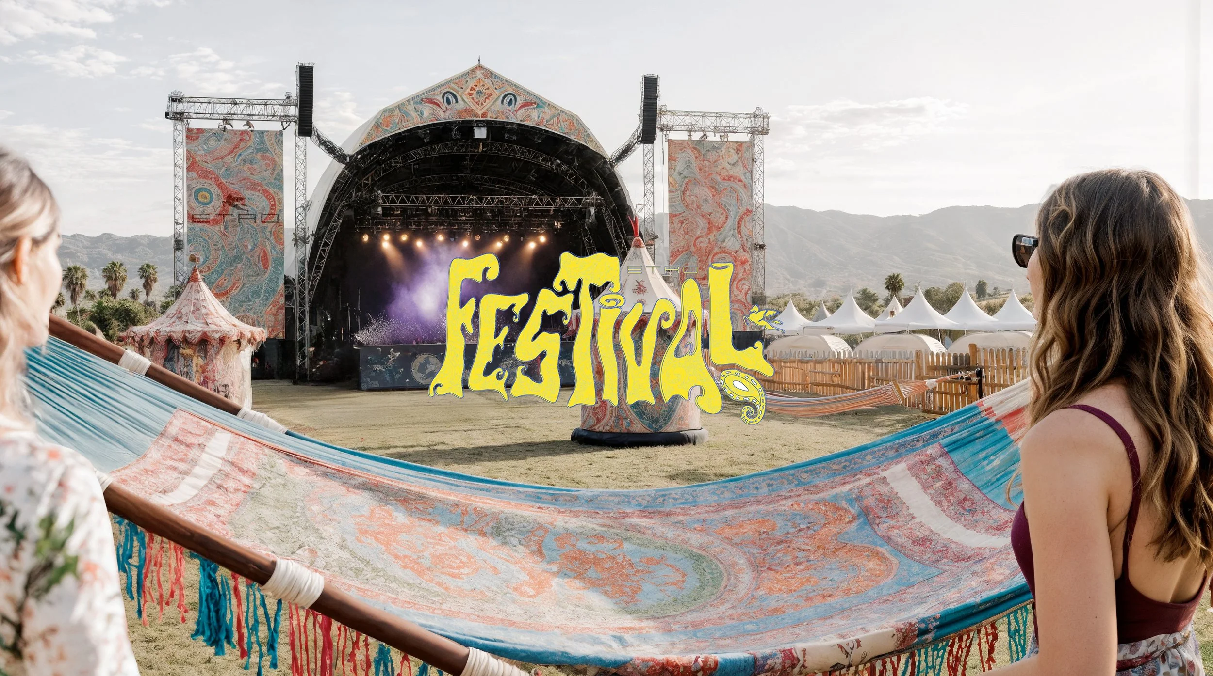
Deliverables
Hand drawn, refined with Illustrator and Photoshop
Website
Photos from Krea 1. Website created with Figma